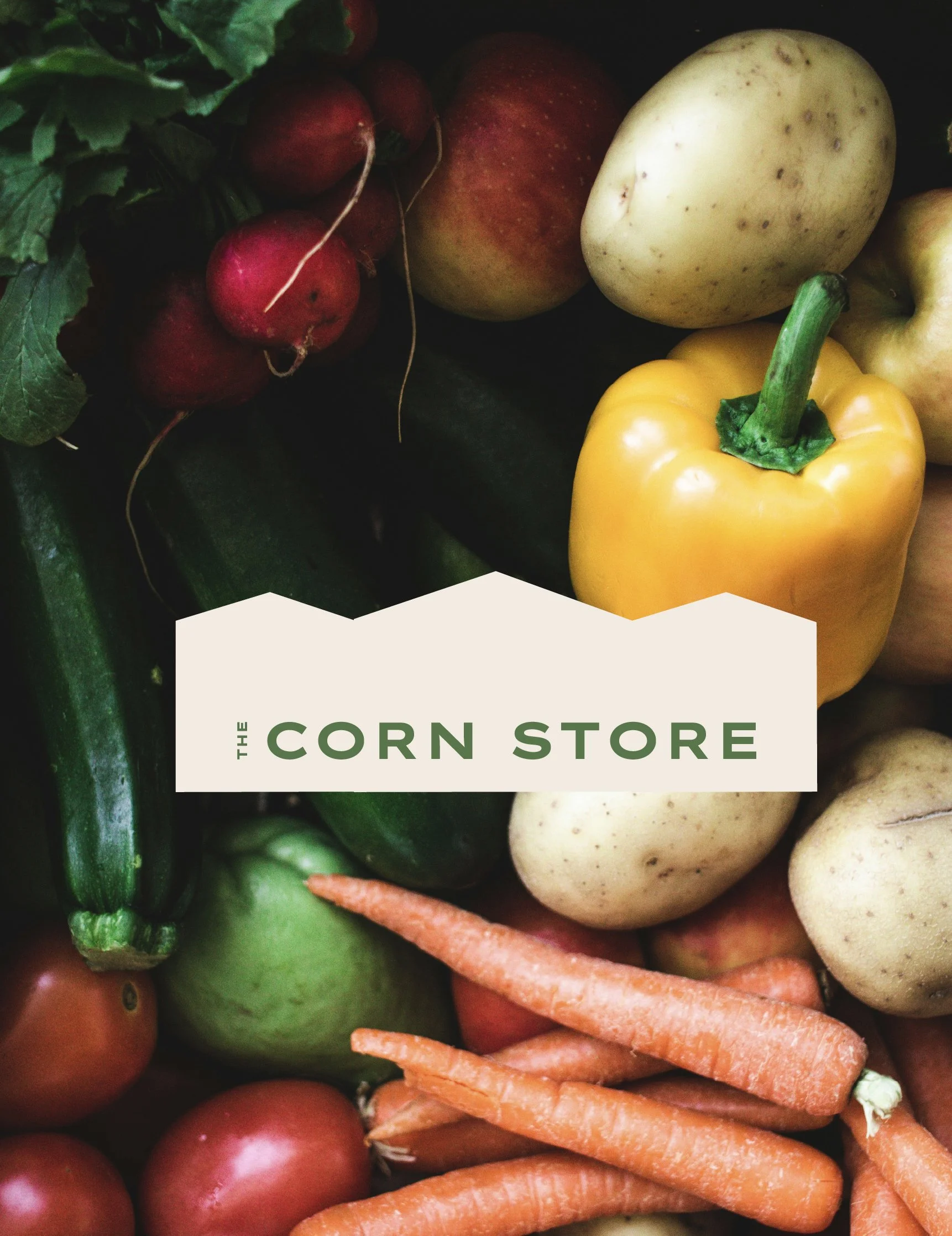
The Corn Store — Farm Shop Identity
ABOUT
As a new business, the aim was to create a visual identity that felt rooted in farming culture rather than typical café branding, giving the shop a recognisable presence while staying authentic to its agricultural setting.
BRIEF
Many farm shops adopt branding that leans heavily into café aesthetics or generic rustic visuals.
For The Corn Store, the challenge was to develop an identity that:
• Felt local and agricultural rather than coffee-shop led
• Worked across small applications such as egg boxes, signage and packaging
• Created a recognisable mark for a brand new business entering the local market
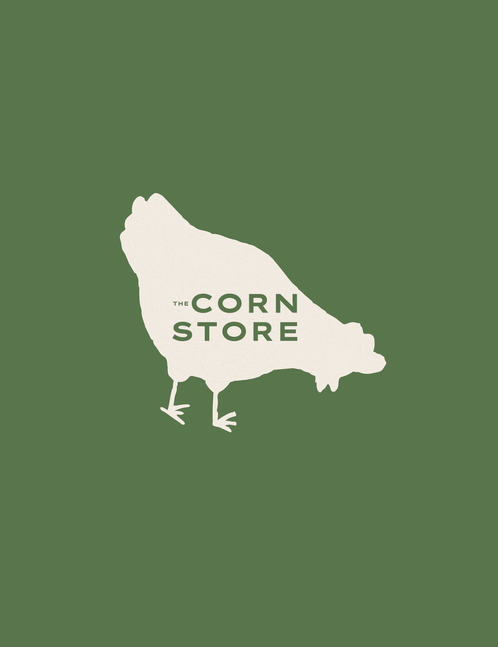
• Balanced traditional farm character with a contemporary graphic language
The identity needed to feel honest and grounded while still giving the shop a distinctive stamp.
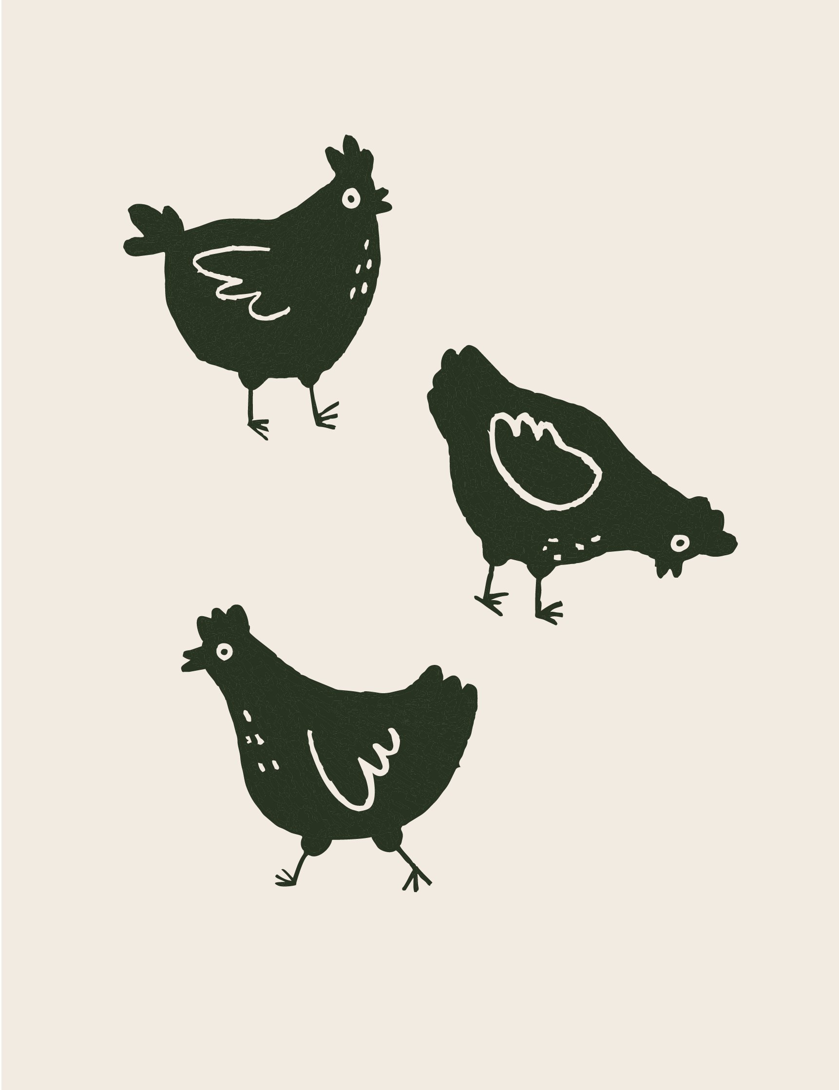
A small series of hand-drawn chicken illustrations were created to introduce warmth and personality into the identity.
These illustrations can be used across posters, packaging, and point-of-sale materials to create a recognisable visual language tied directly to the farm environment.